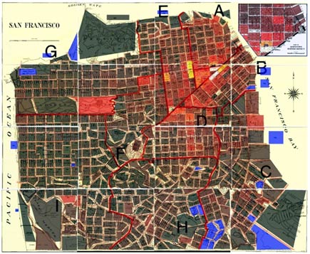
A programmer named Lawrence Kesteloot was considering buying a house in San Francisco. In the process of researching neighborhoods he created this interesting mashup showing crime rates in San Francisco by neighborhood.
Kesteloot mentions the significant caveat that “The color represents the number of crimes, but really it should represent the number of crimes per unit area, since some plots are much larger than others. For example, just below the two bright yellow plots are two smaller plots that are suspiciously dark. It’s probably because they’re smaller that their numbers are lower in absolute terms. ” Maybe this is also part of the reason Golden Gate Park looks dangerous. Probably some people had things stolen out of cars, but I have parked there many times without a problem or a worry.
Still, it’s a suggestive visualization. Yellow represents the highest number of crimes. See the bright yellow areas in midtown between Polk and Larkin? That’s where I eat lunch most days.

1 Comment
1 Pingback